Chapter 5. Site Maps
![]()
A visual representation of the relationships between different pages on a web site. Also known as a structural model, taxonomy, hierarchy, navigation model, or site structure.
Designers and information architects use site maps to represent the hierarchy of information on a web site. Site maps generally illustrate “membership” relationships, where an item lower on the map belongs to an item higher on the map.
While site maps only approximate navigation pathways, readers generally understand that people have multiple ways of accessing content at the lower levels of the hierarchy. Since external search engines allow users to bypass upper levels of the site altogether, the pathways on a site map may be better representations of how to navigate up.
Site Maps Are Content!
Throughout this chapter, I’ll draw a clear line between site maps and content. A preposition-heavy definition would read: A site map is a depiction of the structure of content on a web site.
So, what is content? The word content evokes the stuff that CNN.com and WashingtonPost.com and WikiPedia.org are made of—static, long-form “articles,” maybe with pictures. Of course, content can be other stuff, too. Table 5.1 describes different ways of thinking about content.
Table 5.1. Content, it’s what’s for breakfast. On the web.

For the purpose of this book (though you’re welcome to use it elsewhere), let’s define content as:
Anything accessible on the web that helps people learn, understand, or make a decision.
Let’s also append this corollary definition:
Content is anything on the web that can be linked to anything else.
Besides distinguishing the web as a publishing medium, linking is what gives content a structure beyond itself.
Design Artifacts vs. Online Tools
By the way, just to be clear, these design artifact site maps are not the site maps you find on web sites themselves. Some sites include a “site map” that acts as an index of all the content. While they may be similar in some respects, the design and construction of a site map that someone is meant to use is very different from preparing an artifact in the course of a design project.
Introducing Site Maps
Site maps have become common artifacts in the design process, and even people who have never before seen one in the flesh recognize what they convey.
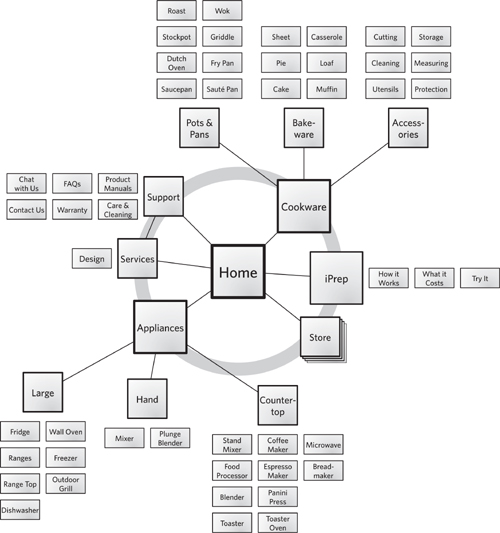
This basic site map (Figure 5.1) shows a site map, somewhat evolved from the typical org-chart format. It shows three levels of navigation beyond the home page and is very specific about the categories of information. On this site, for example, you understand that the Freezer product category lives inside Large which lives inside Appliances. The gray ring “orbit” around the home page indicates which elements are available from the site’s global navigation.
Figure 5.1. A site map, showing three levels of hierarchy after the home page. The emphasis is on classification: The reader gets a sense of how different types of products have been categorized.
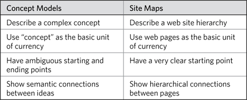
Site maps can be more abstract, too. While this one shows literal pages and literal categories, some site maps focus on the structure of the templates that comprise the site. If site maps get too abstract, however, they will stray into the realm of concept models. In my mind, there remains a pretty clear distinction between them, described in Table 5.2.
Table 5.2. Comparing concept models and site maps, both are node-and-link structures but they describe different kinds of relationships.
Challenges
Most designers and information architects are not only familiar with site maps, but have used them extensively. The challenges with site maps lie in their ability to scale to accommodate larger and more dynamic sites.
Tip: Three Levels Maximum
If you need to communicate more than three levels of structure, consider breaking the site map up into several diagrams. While you might be able to show four levels in a pinch, anything more than that will be difficult to communicate effectively on a single page.
This latter case is important because it also covers situations where each piece of content has multiple locations, where the user can reach a single piece of content through any one of many different pathways. The site map may suit content in a particular set of relationships, but the dynamic nature of the web means that these relationships are not exclusive. It can be important to establish a set of primary categories for the content on the site, but the major risk is that other team members will think that the navigation is static.
• Demand: Because it’s an artifact that people recognize and have seen before, clients may insist on your creating a site map, even building it into the project contract. They may appreciate the elegance and simplicity they’ve seen in other site maps, and their ability to show the big picture. As a seasoned designer, you may recognize that a site map is not appropriate for a particular project.
• Structural reality: With web sites becoming more dynamic, the notion of one page “belonging” to another is becoming an increasingly antiquated concept. The meaningful relationships between content may not be hierarchical. Content may “live” in multiple places on a site, and users may get to that content in many different ways.
• Navigation vs. hierarchy: Even if the information on the site is hierarchical, the challenge with a site map is simultaneously implying how the site’s navigation works. Primary categories in the content hierarchy may not directly translate to one of the site’s navigation mechanisms.
• Detail: A site’s complexity is also reflected in the nuances of the content, which may be lost in a broad-brush diagram like a site map.
These challenges sometimes boil down to answering the question, “Should I be doing a site map at all?” For sites that consist of information that people will consume in some way, a site map is indispensable because it allows the design team to create a model for the structures that hold that information. It facilitates the rest of the design process because it allows the project team to deal with broad categories consisting of multiple pieces of content rather than every individual piece of content. This is especially true for design projects involving migrating an old site to a new structure, where the big picture of a site map can help ensure that everything has a place.
Anatomy of a Site Map
At its most stripped down, a site map is a collection of web pages with connections between them. The additional layers of a site map can help create a more specific understanding of the structure a site map is trying to communicate. Layer 2 includes information on different types of pages and links, while layer 3 includes further context—the basis for structuring the site as shown in the map.
Table 5.3. Layers of a site map, building from basics.

Layer 1: Boxes, Arrows, and Little Else
At its essence, a site map is a collection of shapes connected by lines. The shapes represent different pages on the web site. The lines can be structural, showing how users navigate through the information hierarchy.
Pages and templates
The nodes in a site map correspond to pages on the site, but even simple site maps sometimes show more nuance:
• Just a page: The basic unit of currency in a site map is the page. Pages are typically represented by a square or rectangle, and sometimes by a circle, and they are always labeled with the name of the page.
• Group of pages: A node on the map represents a set of pages that share some function or purpose. Of course, your site map can include both individual pages and groups of pages, in which case it should clearly distinguish between them.
• Asset: Your site map may include things other than HTML pages, specifically downloads of other file types. If you’re keeping your site map basic, you can differentiate these kinds of downloads from regular pages by including the file type in the label—for example, “Company Overview (PDF).” If you decide to make your site map more elaborate, as described in layer 2, you can differentiate between these different formats visually.
• Category: Finally, a node may represent an entire area of the site. More than just a group of pages, a node on your site map can represent an entire section consisting of many, many pages. This works well when you just want to present a general structure for the entire site at a very high level. A site map using areas, rather than groups or individual pages, can act as an introduction to a much more complex site map or set of maps.
Figure 5.2. The nodes of a site map can include various nuances of a “page,” each giving the reader a slightly different impression of how the page works. Regardless of the meaning you assign to each type of node, be sure to apply them consistently.

Figure 5.3. Different shapes for nodes give the site map a distinct feel.
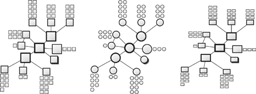
These days, however, most pages on a web site are generated “on-the-fly” combining content from a database with a template. Site maps generally reflect the relationships between those templates. To distinguish between a unique page and a template page, I generally visualize templates with a “page stack.”
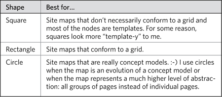
My tastes go through phases, but I generally represent pages on a site map with squares. At the lower levels of the site, these become rectangles to save space and accommodate longer labels. You can also use rectangles or circles.
Table 5.4. Different shapes for nodes in site maps can be good for different situations. Whatever you do, be consistent and try not to use more than one shape.
Finally, the labels on the nodes should correspond to the page name or page template. It’s best to err on the side of using user-facing labels. That is, the site map should use the names of the pages that users will themselves see on the live site. When labeling templates, however, this isn’t possible: Users will never see the name of the template. Instead use the content type.
Links
The links between nodes are deceptively simple. There’s a lot going on behind the connections between the pages and templates of your site. The main decision you need to make is whether you’re showing hierarchical relationships or navigational relationships:
• Showing hierarchy: Typically, site maps represent only the parent-child relationships between pages on a site. They show which pages “belong” to others. Linking one page to another shows that that page has a more narrow focus on the same topic. While this relationship also implies navigation, it tacitly acknowledges that there are numerous ways to browse to the pages.
• Showing navigation: When mapping sites with a less rigid hierarchy of content, the map can show the primary ways to travel between major destinations.
While I’m wary of geographic metaphors applied to the web, in this case a comparison to urban landscapes can help clarify the hierarchy/navigation distinction. In answering the question “Where is the Washington Monument?” you might say:
The Washington Monument is on the National Mall in downtown Washington, DC.
This describes a hierarchical relationship between regions in Washington, DC. But you can also answer the question this way:
The Washington Monument is a ten-minute walk from the Smithsonian metro station on the orange and blue lines.
This describes a navigational relationship. It indicates where the Washington Monument is based on how to get there.
Figure 5.4. Hierarchy vs. navigation described through a geographical metaphor.

Generally, connections don’t need labels on a site map because every link represents the same thing: belonging. Where you want to distinguish between different kinds of belonging, you can use different line formats.
Layout
The site map’s layout—how the nodes and links are placed on the page—is crucial for communicating a site’s structure. Site maps that show hierarchy should be laid out to reinforce those relationships. Usually this means aligning the nodes to a grid and laying them out top-down. When a site map is meant to emphasize navigation, strict adherence to a grid is less necessary.
The advantage to org-chart-like site maps is that they are easy to understand because they follow a convention of sorts. On the other hand, they don’t show a lot of detail, and this format can take up a lot of space on the page. If your site map means to communicate strict hierarchical relationships between the content areas, an org-chart approach is your best choice. The layout reinforces the hierarchy and readers can look at any node and immediately ascertain where it sits in the overall structure.
If the site map’s emphasis is instead navigation, or the hierarchy is less strict, consider a layout that isn’t confined to a grid. A diagram more like a concept model communicates the inherent complexity of the relationships between the information. A web-like layout is appropriate when the structure:
• Operates at a higher level of abstraction: Site maps capture templates or content types, not individual categories or pieces of content.
• Emphasizes the hierarchy of content types: Templates relate to each other differently from topical and subject-driven categories. Some templates are “parents” to others when they contain a basic layout or structure that is adapted by “child” templates.
• Describes navigation between templates: Such pathways are not necessarily hierarchical in nature, but instead might follow more of a hub-and-spoke model.
Figure 5.5. Comparing layouts on site maps that show (a) strict hierarchical relationships and (b) not so much.
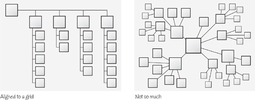
With a looser layout, however, you need to make sure you enforce the hierarchy with other visualization techniques. Moving central pages to the middle of the page and increasing the size of the primary categories can cue readers on where to start. You may have to take a moment to familiarize your project team with the new approach. Use an example or two to show how this format changes the emphasis of the site map without completely abandoning hierarchy.
Layer 2: Elaborating on Pages and Links
Rectangles connected by lines can say a lot about the structure of a site, but your situation may call for more detail. Layer 2 builds on the basic structure created by the boxes and lines to elaborate on each.
Page details and distinctions
Your project may require supplying some detail about each page or providing some distinctions between them. One of the most common:
• Existing vs. new: Site maps may aid projects to update web sites by incorporating new information while leaving the old mostly intact. In this case, before-and-after site maps might be less useful than a site map showing how the old stuff fits into the new stuff. (Or the glass is half full, your choice.)
Some other useful distinctions:
• Global navigation item: Your site map needs to show hierarchy, but you also want to clarify what items belong in particular navigation mechanisms. Marking a node as “appears in global navigation” or “appears in product navigation” can help readers understand the browsing tools as well as the underlying structure.
• Template types: Different areas of the site may support different content but rely on the same templates for displaying that information. Site maps can visually distinguish the nodes to indicate which templates are in use.
• Administrative or management issues: While some organizations are more dynamic than the information on their web sites, it can be useful to depict the relationship between the content and the people supporting it. Administrative and management issues can include ownership, timing, or frequency of updates.
• Partial pages or page elements: In some instances it can be useful to show that a component appears on a page. Too early in the design process and it might be difficult for you to represent the details of page contents on a site map. In this case you can represent a page element as a node as well, changing the shape or other stylistic element to distinguish it from a full page.
So, how to distinguish? Table 5.5 shows various techniques for describing the differences between nodes.
Table 5.5. Embellishing nodes in your site map can help clarify functions or properties of different pages.
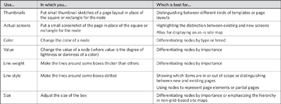
Use caution with these styles. My site maps never use more than two or three stylistic distinctions, and I always apply them sparingly. Too much variety in line weight, for example, can have the opposite effect: It creates too much visual noise to let readers make useful distinctions.
Grouping pages
Even though site maps show categories through hierarchical linking, there may be other useful ways to group pages together. Here are three common cases:
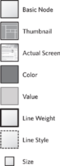
Figure 5.6. Applying styles to a node can distinguish it from its peers.
• Page pools: Sometimes links on a category page are drawn from a pool of content. For example, the site map has a pool of white papers to draw from. The link between the category page and the pool shows that the category may link to one or more pages in that group. You could do the exact same thing with a page stack icon, but visually a pool may be easily linked to many different categories. It also communicates that from a hierarchical perspective, these are a set of interchangeable pages.
• Functional groups: You can group pages that relate to each other because they serve some common purpose.
• Contextual groups: A collection of pages can capture some external context, like being intended for a particular set of users or managed by a particular part of the organization.
So, how do you group nodes on a site map? Draw a line around ’em! Or, for the more subtle among you, use a backdrop. An enclosing shape allows you to represent links to the group as a whole, rather than having to link to individual pages. Sometimes I create a mass of pages to do the same thing.
Figure 5.7. Grouping nodes on a site map involves enclosing them with a box, circle, or irregular shape. You can use a line or a lightly shaded backdrop. You can also just create a mass of pages.

You might have noticed that pretty much any of the distinctions you might make at the “node level” you could also make by grouping the nodes. The value of visually grouping pages together is that they can be treated as a unit, at least from a hierarchical perspective. Individual white papers may be managed differently inside the organization, but from the perspective of the site’s information architecture, they can be treated the exact same way.
There are any number of ways to group pages visually, but the key concern from a design perspective is to avoid confusing groupings with links. The visual conventions you use to group pages, therefore, should be subordinate to the links between them.
Additional connections
Site maps that primarily show hierarchy may need to depict other important relationships. Layering an entire navigation system on top of a hierarchy is challenging and likely unnecessary. But showing some important navigation links can help complete the picture of the user experience, especially in light of some of the ways we’ve embellished nodes.
Other links you might consider:
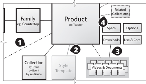
• “Also linked from…”: Web sites will be rife with cross-linking, and showing every possible link is pointless. But there can be value in highlighting particular links. (Figure 5.8, annotation 1)
• Context-setting link: Sometimes, you might be designing—and therefore depicting—only part of a web site. Showing pages that may be out of scope for your current project can help set the context for the in-scope pages. I tend to make these nodes and links recede (lighter values). They’re there to answer questions like, “How do I get here from…?” (Figure 5.8, annotation 2)
• Connecting to groups: Links don’t have to occur between specific pages. In this case, the site map shows a link to the group of pages, indicating that every page in the group is linked, without showing multiple lines. (Figure 5.8, annotation 3)
• “Appearing in…”: Some of your nodes may represent partial pages or page components. Though these nodes should be formatted differently, using a differently styled connection will also clarify that the link isn’t exactly navigational or hierarchical. (Figure 5.8, annotation 4)
Figure 5.8. Beyond hierarchical connections, there are other kinds of links you can use in a site map. This portion of the basic site map shows all four approaches: also linked (1), context-setting (2), groups (3), appearing-in (4).
Layer 3: Providing Further Context
The information in the last layer takes readers outside the user experience and provides context for the site’s structural information. “Context” refers to other aspects of the project, from content and editorial strategy to business objectives and technical constraints.
Besides applying styles to the shapes themselves, there are a few other techniques for supplying more information about the pages in a site map (Figure 5.9):
Figure 5.9. Additional information about a node can be embedded using annotations or little tabs. Use these techniques consistently—a tab, for example, should always represent a template type. Also style them appropriately. If annotations are meant to point out problems, use a distinct color.

• Annotation: Sometimes, it’s easiest to simply embed a note right next to the node. I use a distinct typeface and color, though the style will depend on the purpose of the note. Pointing out problem areas, I’ll use red text.
• Little tabs or corners: If you can use a short word to distinguish nodes, you can embellish the node with a tab or corner to label it. I like this approach for classifying nodes by content type or template type.
• Icons: A little more intrusive than either of the other two techniques, a small icon is useful for distinguishing nodes based on page type or user need. I’d also use icons to highlight pages from an administrative perspective, distinguishing them based on project phase or priority.
The context you provide in a site map depends on the purpose of the map. Be sure you consider how you’ll be using the site map (see “Purpose and timing” in the “Basic decisions” section later) before adding all of the following data points.
Project management and planning
Site maps make great project management tools, especially when you need to look at a big picture and determine a plan of attack. Site maps offer an overview of the landscape and a chance for project participants to move their pieces around to focus on specific territories. (Be grateful it’s taken me this long to milk the metaphor.) Project management considerations include:
• Priority: Which areas of the map will you pursue first?
• Order: How do areas of the site correspond to phases in the project?
• Ownership: Who is responsible for different areas of the site?
Content and editorial strategy
Site maps make great conversation pieces between information architects and content strategists (if your team makes such a distinction). Where information architecture focuses on the structure of the experience, content strategy focuses on what people find in that experience. The site map is a tool for making decisions about content, both right now and from here on out:
• Emphasis: What’s the most important thing on this page? The content strategy will need to specify how to prioritize content. Prioritization can be topical (which kind of content) or thematic (what do we need to say).
• Updates: Another way to distinguish pages is by the interval of their editorial lifecycle. Areas of the site requiring more frequent updates get one color and those that are static get another.
• Source: An ideal label for content migrations, the source of the material can be added as an annotation with the specific URL.
Content strategy is an emerging discipline, becoming more formal as the web matures into a robust medium for large-scale publishing and consumption. As the needs of content strategy become more structrured and specific, you will need to reflect and document these needs in the diagram.
User needs
Illustrating a relationship between the site’s structure and user needs can provide a rationale for the approach defined in the site map. Some site maps show the relative importance of different pages based on how well they address the needs of the target audience. A more robust way to capture nuance between different groups in the target audience is to mark pages based on their importance to different personas.
Creating Site Maps
Knowing the parts of a site map can only take you so far. This section describes how to put them together.
Basic Decisions for Site Maps
The simplicity of site maps makes it tempting to dive right in without careful planning. Like any design diagram, however, a little planning goes a long way. Who will use the site map and how they’ll use it can make a huge difference in its final format.
Purpose and timing
A site map shows one of two things in the design process:
• As-is state: A site map showing what the structure of the site is today. Frequently fraught with notes and exceptions that highlight the organic growth of content.
• To-be state: A site map showing the target information architecture for the site. If building a site from scratch, the emphasis here may be rationale–why this structure makes the most sense. If migrating an existing site, the emphasis will likely be on mapping the old content to the new structure, pointing out potential gaps.
A site map serves several purposes on a project, and these are not mutually exclusive:
• Depict a navigation strategy: A navigation strategy answers the question, how do users get from one area of the site to another. Navigation strategies describe one or more systems for browsing content on the web. A site map can help zero in on appropriate strategies by showing the range of content and desired pathways between them.
• Illustrate a classification strategy: A classification strategy establishes a framework for categorizing information. Those classifications yield a structure for content to live in, and a site map can help you visualize the resulting architecture of a categorization scheme.
• Validate a content strategy: A content strategy describes what content you’re going to use where. It operates within the framework established by the site map to optimize delivery of content appropriate to the anticipated target audience. Like a content migration (see next bullet), a content strategy can use a site map to see all the gaps it needs to fill.
• Facilitate a content migration: In a content migration, a web site is being moved (in part or in whole) to a new structure. The reasons for doing so are myriad and usually slightly irrational. A site map helps this process by allowing you to map old content to new content.
• Diagnose any of the above: By depicting the site’s structure in its current state, you can gain insights into current problems (and strengths) of the navigation, classification, and content strategies.
The inherent big picture-ness of a site map makes it an ideal tool for the beginning of the design process. It sets the stage like a concept model does, but (done right) will provide even more actionable input into the design. (Concept models are useful for establishing an overall approach, but don’t necessarily provide meaningful design principles.)
Audience
The message behind a site map is relatively simple, which means there isn’t much nuance based on who you’re building it for. Designers, developers, and project stakeholders all expect the same thing—a document that establishes site structure, site navigation, and page priorities.
Content development
Before committing the site map to paper, you may find it useful to create a list of all the pages you want to capture in the document. This approach allows you to think through each data point you might want to capture for each area of the site—how important it is, what type of page it is, or any of the other distinctions mentioned in layers 2 and 3.
If you’re using the site map for one of the specific purposes just discussed, Table 5.6 identifies ways to embellish the diagram.
Table 5.6. Embellishments to site maps should be driven by the purpose of the diagram.

Regardless of what you call them (pages, templates, what-have-you), the nodes on a site map represent discrete parts of the user experience. They are recognizable chunks of the site that are responsible for presenting information, as well as informing users of where they are in the structure. It can be easy to lose sight of this when you’re pushing boxes around a page.
A crucial decision for each node is the level of abstraction. This is a tension between two extremes: Is the node purely structural or is it a specific piece of content? Does the node represent, at one extreme, any category of product? A broad category of product? A very specific category? Figure 5.11 shows how a single concept (refrigerators) can be expressed in three different ways, at three different levels of abstraction.
The decision is ultimately one of design: The information architect’s job is to figure out the range and depth of templates required to create a meaningful experience. But this decision cascades to the deliverable: How do you successfully convey the purpose of a category through the visualization?
Though more and more, I find my information architectures operating at a higher level of abstraction, there are two risks:
• Exceptions: Instances of a category may have exceptions. So, while Refrigerators maps accurately to the abstract structure, a category like Accessories might not.
• Additional documentation: Even though the abstract site map might successfully describe the site’s underlying structure and template system, you may need additional documents to specify the exact content. What are the exact categories, subcategories, and products? A spreadsheet (or something) accompanying the site map will help flesh out the picture of the user experience.
Figure 5.10. Levels of abstraction may seem like just another information hierarchy, but what this diagram shows is that you can describe the same collection of content (refrigerators) in a few different ways. Any one of these labels (“category” “product family,” or “appliances”) is a legitimate label describing the same group of objects. Ranges and toasters could also be described with these labels. At the same time, the labels you select have dramatic implications on the overall design of the site.
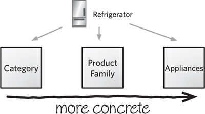
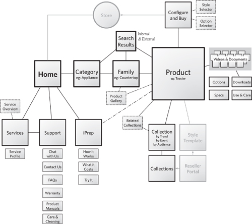
Figure 5.11. Rendered as an abstract structure, the sample site looks substantially different. The emphasis here is less about “what lives where” and more “what’s the structure of the experience”. Though the site map references specific content, it does so by way of example, showing what kinds of content are represented by different templates. The links are more nuanced because templates (pages at a higher level of abstraction) can relate to each other in more subtle (and more numerous) ways.
Tips for Stellar Site Maps
The basic org-chart format for this artifact is adequate, and if this is your first site map, that may be the easiest approach. After you create a few site maps, however, you might begin to see some inadequacies with such a strict layout. These tips can help you move beyond the rigid presentation of site maps.
Isometric layout
One trend in site maps is to use an isometric layout. In an isometric layout, the diagram creates a sense of perspective by skewing the angles on the nodes. (A picture is worth a thousand words here.) Nodes are placed behind each other to show them receding backward. This depends on keeping to a grid, therefore reinforcing the sense of hierarchy. Isometric layouts are best when:
• Showing hierarchy: Navigational layouts, which may not easily conform to a grid, can be challenging to represent with isometric site maps.
• Showing as-is states: You can use screen-grabs for the nodes to show the hierarchy of existing pages. With the challenges of labeling nodes in an isometric site map (see Figure 5.12), it’s best to use recognizable pages that don’t require extensive labeling.
Figure 5.12. Isometric layouts for site maps are useful for communicating a strict hierarchy.
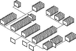
In isometric site maps, labels generally appear outside the node. The shape of the node (a skewed rectangle) makes it difficult to include legible labels. Arranging the nodes “behind” each other leaves less space on the node to put a label. You can label nodes by moving the label outside the shape, but this takes up more room.
Figure 5.13 shows that some diagramming applications don’t let you skew the text to align appropriately to the isometric grid.
Figure 5.13. The challenges for labeling nodes in isometric site maps.

That said, isometric site maps are great for showing quantity and groupings. They are powerful tools for communicating existing challenges of managing content.
Visual language
In short, create a stencil of your favorite site mapping shapes and use them over and over again.
A stencil will help you be consistent across different artifacts and within a diagram. It will force you to make difficult (but good and important) decisions about what to leave in and what to leave out. It’s not about constraining your creativity, but focusing it on devising the most effective symbols for your stencil. The stencil will then reinforce your set of visual conventions and guidelines.
The most effective way to develop a visual language for your site maps is to make a list of everything you need to describe in the diagram. After prioritizing this list, you can identify how to represent each kind of information.
TIP: More Isometrics
The single best source of learning more about isometric site maps is the book Mapping Web Sites, by Paul Kahn and Krzysztof Lenk. They provide a range of excellent examples.
My firm released templates for creating isometric site maps as part of its EightShapes Unify documentation system.
Large maps
One way to tame an unruly site map is to break it up across several different pages. Separating each logical section of content onto a different page makes the map easy to understand because each page is more or less self-contained. A cover page can show how all the smaller site maps fit together.
Level-Up Your Site Mapping Skills
As web sites become more complex and dense with information, it will be more difficult to capture all that information in a simple two-dimensional map.
Keep connections simple
Though it can be tempting to show all the different connections, keep your site maps to only showing the ones that help communicate structure.
Decide what links you must represent based on the purpose of the diagram and the overall structure of the site. In either case show only those links that communicate the essential structure.
Tip: Stencils in Diagramming Apps
Most illustration tools—like Microsoft Visio or Omni-Group’s OmniGraffle—allow you to save individual shapes in a stencil so that you can reuse them. Once you have a visual language that works, there’s no point in reinventing the wheel.
Minimize distinctions
Web pages come in all shapes and sizes, despite your best efforts to put them in nice little buckets. As described in layer 2, a site map can make many different kinds of distinctions between pages, from the behind-the-scenes technology to additional layers of information architecture to project management issues. You may be tempted to pack as much information in as possible—after all, it’s a special feat to communicate lots of detail in a little space. On the other hand, this can make your site map dense and clumsy.
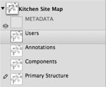
One way to show additional information about the pages is to create multiple versions of the site map. Some tools offer features to make it easy to (literally) layer on different kinds of information. Most diagramming applications have a layering function that allows you to hide or show different parts of your drawing. Regardless of how you make it happen, you can create different versions that show different aspects, so one version might focus on the technical issues and another on the editorial issues.
Oversimplifying
You can also go in the other direction, showing too little information. Watch out for:
• Missing content or categories: It may seem unlikely that you’ll leave out entire sections of the site, but it happens. Focusing on other higher priority or more visible areas can leave others falling through the cracks. If you’re responsible for the site map, you’re likely to be responsible for making sure that doesn’t happen.
• Missing distinctions: Showing how pages differ from each other is a crucial piece of information for planning sites. If you’re struggling to capture all the distinctions, leaving some out is a good inclination, but you don’t want to leave too many out.
• Missing links: Most of my site maps incorporate the assumption that users can pretty much get from any page to any other page. Depicting every one of those links is, therefore, unnecessary. But to show only one kind of linking may be doing your structure a disservice.
How do you avoid leaving out too much? A couple techniques:
• Make a list of everything you think you could include in the site map and ask the people who will use the diagram to prioritize. “Look, there’s a lot going on here. Is it more important for me, at this stage of the project, to distinguish between content templates or content ownership? I don’t think the diagram will support both.”
• Check and double-check your work against the source material. Have a content inventory? Is there a place for everything on the content inventory in your site map?
Presenting Site Maps
A site map can communicate a site’s structure effectively, but it contains complex and sometimes controversial information. The only way to work through these issues is through a meeting. Or two.
Establish a Purpose for Meeting
Most of the site map–specific meetings I lead or sit through are attempting to answer one of two questions: “What’s here?” and “What’s missing?” (Table 5.7 describes ways to position a site map in these meetings.)
Table 5.7. Different ways to position a site map in a meeting introducing the artifact.

Providing a lay of the land: What’s here?
In the introduction to the site map, your role is to play tour guide. Like any good tour guide, your job is to, in a sense, personalize the landscape for the people on the tour. At the same time, you need to communicate what makes this particular structure unique. And you thought the hard part was walking backwards.
An introduction has a few key messages:
• Unifying theme: This is the singular vision that led to the design of the structure. For site maps describing as-is architectures, your unifying theme will not be design vision as much as key insight. “In putting the site map together, we realized that though most of the organic growth occurred in the products section, lots of good content was added to solutions, too.”
• Important landmarks: Certain aspects of the architecture are going to be more important to meeting participants. These landmarks satisfy some need that’s important to the stakeholders, but also serve as a means for illustrating the unifying theme. They can also be a bridge for drawing participants’ attention to another aspect of the architecture that has been neglected.
• What’s changed: If this isn’t the first time you’ve shown the site map, your overview of it isn’t an introduction as it is a version history. As you present each evolution, your message is “We heard your feedback and here’s how we responded.”
For the sample abstract site map in Figure 5.14, here are the key messages I might use in an overview meeting:
Figure 5.14. OmniGraffle’s layers make it easy to show and hide different parts of the drawing.
A “lay of the land meeting” may happen several times over the course of a project. You may have new stakeholders who require a tour. Equally likely, the emphasis of the meetings will change from providing an introduction to showing how the structure has evolved over the course of your work.
Validating approach: What’s missing?
Once stakeholders are familiar with the site map, they become crucial reviewers. In some cases, you’ll discuss the site map with people who are more familiar with the content and site requirements than you are. They will be able to identify where the site map does not align with content. You’re looking for two kinds of gaps:
• Where does X go? The project team needs to understand how a particular piece of content fits into the overall architecture.
• What do you expect to go here? The project team needs clarity on what content will fit into a particular category.
You may show up to the meeting with questions of this ilk. You might leave the meeting with an inventory of questions like these about particular pieces of content. The purpose is different from an introductory meeting: You’re seeking some movement from the current state of the site map to something better, more refined, more complete, more detailed.
In these kinds of meetings, the tone must reflect two messages:
• This is just the beginning: There will be lots of opportunities to validate the site maps as the project progresses. I usually use such a message to help set people at ease, noting they will have other opportunities to provide input. BUT…
• This is a crucial step for ensuring we’re building from a solid foundation. While “this is only the beginning” takes the pressure off, participants also need to understand that their inputs need to be correct. Decisions at this stage can not be arbitrary.
If you uncover critical missing components which slipped through, and the site map review brought this to light, then your meeting has been a success.
Adapt the Basic Meeting Structure
The generic meeting structure described in the introduction requires little modification for site maps. Here are some ideas on how to tailor the sections for a site map discussion.
1. Establish context
At the beginning of the meeting you help participants understand where you are and where you’re going:
• Project context: A site map, while providing concrete information, can feel very abstract to participants, and it can be easy to lose the thread of your design process. By telling a quick story at the beginning of the meeting, you can help project participants locate the site map in the overall project.
• Users: Context also means reminding the team who the users are and why they’re coming to the site. For each type of user, provide an overview of their needs and hint at how the structure supports them. You’ll have ample opportunity to dig into these details later in the meeting. If user groups have been prioritized, start with the highest priority group. If not, you can start with the user profile that represents the most common tasks or scenarios.
2. Describe visual conventions
Before digging into the details, make sure meeting participants understand the format of the site map. Explain the visual conventions you used, and pay particular attention to the distinctions. From the participants’ perspective, every box represents a page. So, if you’ve gone out of your way to distinguish the boxes, take a moment to confirm that the people in the meeting know what those distinctions mean.
3. Highlight major design decisions
With a site map, the major design decisions are generally structural—what categories you chose and how you connected them. In this part of the meeting, your job is to point out the important decisions you made about the structure. These could include:
• Unifying theme driving the structure: Structural themes can describe why the primary categories were selected. They can highlight novel ways of classifying content or navigational connections. They can be expressed as an objective, as in “In addition to supporting people finding just the right oven, we wanted to create a structure that let you create meaningful groups of products outside the context of the merchandising hierarchy.”
• Significant changes from the existing site: Entire areas have been moved whole-hog elsewhere or renamed.
• Surprises: Items got categorized in areas that you wouldn’t likely expect, but ultimately have the best rationale.
There are other decisions reflected in this diagram. For example, your site map may specify the range of templates needed to support the site, or may be specific about which templates apply to which pages.
4. Offer rationale and identify constraints
No doubt the best rationale for structural decisions stems from the people using the content. If you have insight into how they go about finding the information on the site, use this to justify your design decisions.
There are, of course, other constraints that might drive design decisions on a site’s structure:
• Technical constraints: It can be hard for a designer to understand developers when they say, “We can’t put that content there.” Still, legacy content management systems (homegrown or otherwise) often impose constraints on how content is structured. Acknowledging these in your meeting is important, but it’s equally important to focus on the technology, not the people responsible for the technology.
• Political constraints: More challenging to point out, but important nonetheless. In this case, you’ve categorized or linked content because of some political issue in the organization. You are not empowered to sort out these issues within the organization itself. And while it’s perhaps expedient to avoid naming names, it is important to acknowledge that the constraints yielded a design different from what you would recommend.
Be sure the meeting participants leave understanding why you chose to make certain critical decisions, and why and where you were constrained to make others.
5. Point out details
The purpose of this section of the meeting agenda is to dive into specific examples. Contrasted with the “major design decisions,” which describe the design in a more thematic way, this portion of the conversation should illustrate those themes with specific examples. For site maps, these details include:
• Connections between content: Though these will be self-evident from the diagram itself, you can point out some good examples of how content is linked.
• Classification and labeling: Point out some of the categories and the labels you’ve chosen for them. Describe what content fits in this category.
• Template choices: If the site map indicates what templates are in use, be sure to point out an example of each. In addition, inventory all the templates that are needed to build the site structure specified.
• Exceptions: Draw participants’ attention to any part of the site structure decisions strays outside the design principles, standards, or vision.
The objective here isn’t to cover every box and every link, but use good examples to describe the range of design decisions you made.
6. Communicate implications
Every design decision has a downstream impact on engineering and on the business as a whole. Those communicated in site maps are no exception, and for site maps describing a new direction, you should be prepared to enumerate:
TIP: Don’t Read Every Box
Quite simply: Don’t use the meeting time to read every label in every box. It’s boring. If you need detailed feedback on the site map, give people homework—five days or so to put together their comments—and remind them several times during the course of the week.
• Content gaps: In meeting business and user needs, the new structure may demand new or revised content. Stakeholders need to understand that launching a revised structure also means updating and filling in content.
• Dependencies: Crucial to project planning, dependencies on a site map show which areas of the site affect others. Especially if you’re talking about the process for building a site, presentation should point out where particular areas of the site will need development earlier in the project.
• Template changes: Whether you’re adding some new templates to the mix or making significant changes to existing templates, the engineering team will need this information to understand the scale and scope of their work.
• Operational impacts: New structures mean new spaces to fill. The structure you designed may create an ongoing need to generate new content.
As-is site maps will yield the same implications, just in a different time frame. You can use the site map to talk about the current downstream impacts of having such a structure. This conversation can be a useful input to project planning, especially if you’re using an as-is site map to discuss how changes to the structure might impact other areas of the organization.
You can communicate these implications in conjunction with the details (in the previous section “Pointing out details”), but prior to transitioning to “Soliciting feedback,” upcoming, you should recapitulate the big ones.
7. Solicit feedback
To get the most effective feedback from meeting participants, you need to establish scope and then break your questions down into two categories.
The scope of feedback establishes constraints on the discussion: It can be easy to wander off into every crevice of the site structure. The site map provides a framework for getting feedback, but you need to direct participants’ attention to the important elements. For a site map, these might include categories, content, labeling, connections, and template selections. (See Table 5.8.) You can direct attention to any or all of these, but be explicit as to why you’re focusing on some aspects, but not others.
Table 5.8. A framework for soliciting feedback on site maps asks two key questions about five aspects of the site structure.
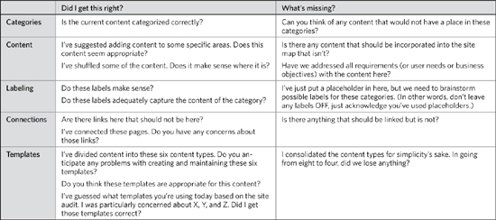
As described in the introduction, soliciting feedback means asking two kinds of questions. Here are those questions mapped against the different areas requiring feedback.
8. Provide a framework for review
Getting people to review abstract diagrams like site maps on their own time can be challenging. Giving them a means for doing the evaluation can help ensure you get the feedback you need and they’re not faced with such a daunting task.
At the close of the meeting, the minutes should:
• Capture the scope of what people should focus on. For example, please review labeling and connections for areas A, B, and C.
• Make a list of remaining questions. Try to be specific, like “Does ‘Appliances’ need to be expanded to clarify that it includes both large and small products?”
• Establish a realistic deadline. For internal reviews of site maps, one to two days is sufficient. For most of my clients, two to four days is a feasible turnaround on a site map.
Ultimately, the point is you should not conclude a meeting with “Please get me additional feedback by tomorrow.” You must provide a set of questions to give them some direction for their feedback.
Avoid Newbie Mistakes
Site maps are rife with opportunities to get off track in a meeting. Every box is another rabbit hole. Stakeholders may direct their attention to the wrong part of your map (labels are particularly tricky). You might also face a situation where site maps surface some organizational politics.
Getting stuck on labels
A question for the philosophers: If categories don’t have labels, are they really categories? As designers, we understand that a category can represent a collection of content and the label can be tentative. A label on your site map refers to a category, but it may not be the exact wording you use on the site.
TIP: Big Labeling Problems
It can be tempting to try to solve big labeling problems. “Solutions,” for example, is a meaningless category. But nearly every web site marketing high-tech enterprise products uses it. It’s wrong, but it works. Instead, direct your passion and energy to some of the more complex and specific problems.
For some conversations about site maps, the labels are out of scope. That is, we’ve acknowledged they’re tentative, we’re not interested in nailing those down at the moment, and our primary concern is getting the structure right. (Can a structure even be right without labels? You’re welcome to tape the philosopher’s mouth closed.)
Thinking of the structure before you hash out the labels is a perfectly legitimate approach and process. But to meeting participants, the labels can be a distraction. Still, if this is the worst thing that happens during your meeting, consider yourself lucky (as discussed in the next section).
To mitigate this risk, build the site map to make the labels look like placeholders, or include a note on the site map.
Figure 5.15. Labeling options when you haven’t zeroed in on an exact label.

When people argue about labels without any real foundation for validating their choices, meetings lose steam and take on a competitive atmosphere rather than a collaborative one. You attempt to redirect attention by writing label ideas on the whiteboard, saying:
These are all great ideas. I’ve captured them on the whiteboard so we can consider them at the end of this meeting if we have time. If we don’t, labeling is the main agenda item for our next working session.
TIP: Discussing labels
If the purpose of your meeting is to define the labels, you should include several alternatives on the site map itself. This shows that you’re considering several possibilities for the label of a section, and it can jump-start the brainstorming. You may not be able to do this for every box or category because, well, thinking of labels is hard. Start the meeting with categories where you have a more substantial starting point: this will get people in the right mood for brainstorming.
The politics of hierarchy
Creating a structure for a web site brings out the worst in organizational politics, which is why so many web sites—especially in the early days—were organized around corporate structure. To validate the design of a new structure, you may need to bring all the different players to the table. With teams consisting of people from every part of the organization, everyone frowns at seeing “their” content buried deep in the site while someone else’s content is at the surface.
Your skills as a facilitator will be challenged. The introduction to this book describes some general techniques for dealing with conflict in design, but here are a few specific to site maps:
• It’s not your content: The desire to “own” something in an organization can overshadow the true need. In this case, while different people may be responsible for creating, managing, and updating the content, it really belongs to the people using the content. If the content is not presented in a way that’s meaningful or legible to them, it doesn’t matter who “owns” it.
• Contrary to vision: A good design process will establish a purpose or vision for each page. This singular summary of what a page is “supposed to do” can be a powerful mechanism for weeding out requests that don’t contribute to that vision.
• Not everything can go on the home page: Stakeholders may wonder why everything isn’t linked from the home page. Your explanation needs to clarify that burdening the home page with a link to every piece of content (or every area) will yield an unusable home page.
• Users don’t enter through the home page: Reminding stakeholders that at least half the entry into their site comes from search, not from visiting the home, can encourage them to think broadly about the role of the home page.
• There are multiple navigation systems: A good navigation strategy includes multiple mechanisms for browsing the site. A single navigation mechanism (say, “topical navigation”) can not realistically provide access to every area of the site.
• Here’s an example: Use examples (both good and bad) from around the web to show what happens when content and structure don’t play well together. While a web site can’t tell us everything about the design decisions behind it, we can speculate about how it came to be.
It can be easy, as a designer, to dismiss organizational politics: All you can do is point out the problems, not solve them. You’re a designer of products, not a therapist. As described in the first chapter, politics can be an obstacle to project completion or a catalyst for compromise. As the designer you can position yourself outside the fray (align yourself with the product or with the target audience, either works for me) and facilitate the process to do what’s best for the project.
Using and Applying Site Maps
Site maps, inherently big-picture views of the project, provide ample opportunity to use them throughout the design process.
Planning Projects
Planning a web site project means, among other things, determining “what will we work on and when?” Site maps figure into this dialog by helping you see the range of possibilities. They can help you zero in on scope because they let you physically draw circles around the areas of the site you will work on.
Figure 5.16. For planning purposes, this version of the site map highlights the scope of activities happening immediately and then attaches phase numbers to other areas of the site.
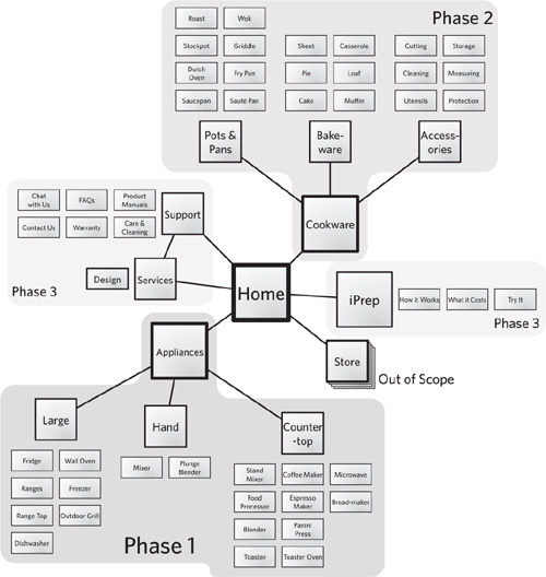
Adorn a site map with dates or phase numbers, and you can show the “when” portion of planning questions. You can use color to distinguish between “what we’re doing now” and “what we’re doing later.”
Planning depends on, well, dependencies. Being able to identify all the moving parts and how moving one affects others is important for establishing a plan. Dependencies determine order and scope: what you need to build when and how much needs building in any given portion of work. Site maps illuminate dependencies by literally drawing connections between areas of the site and templates.
While a site map won’t automatically provide an answer on what you need to build first, the diagram provides a good basis for brainstorming with the team about dependencies.
None of this conversation changes if the site map describes an as-is state. As-is site maps also provide opportunities to describe the phases of the project or identify dependencies.
Site Maps and Wireframes
You can use site maps with other diagrams to show their relationship to the site structure.
If you do nothing else, at least number the boxes on a site map and use the same numbers to identify wireframes (or whatever you’re using to describe screens). Even a simple inventory like this can help with project execution, ensuring that you’ve designed every screen and addressed every dependency.
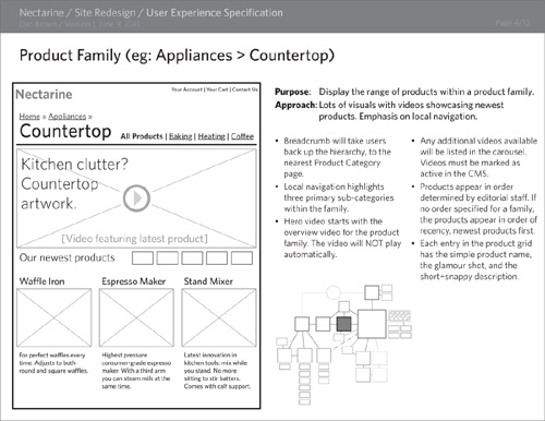
Site maps can become a visual element in other parts of your documentation to communicate context visually. Miniaturize the site map, place it next to wireframes elsewhere in your deliverable, and highlight the relevant box, as in Figure 5.17.
Figure 5.17. Site maps can provide context for a wireframe. In this sample page from a user experience specification, a simplified, miniature site map evokes the structure established in the larger version. Simple contrast differentiation can highlight the relevant box.
The Web’s Cartographic Conundrum
In the first edition I dismissed site maps as a dying artifact—too static and too rigid for the emergent web. They (those site maps) are laughing in my face now as they remain a diagram I use again and again.
They have evolved, no doubt, to keep up with the changing nature of the web. I tend to favor a more abstract version of site maps: one that emphasizes templates over specific content or even categories. My site maps today are shorter lived, too, providing a means for jump-starting the design process.
I hereby change my assessment of site maps: They remain useful blueprints for mapping out web projects, especially in conjunction with other artifacts described in this book. That said, the web continues to evolve, and site maps will need to find ways to keep up.
Parallels between the web and physical space continue to obscure the potential of the web. A “page” on the web continues to lose coherence as a discrete location. Site maps can enforce this metaphor, to the detriment of functionality.
Nathan Curtis, in his book Modular Web Design, envisions the design process as creating a collection of Lego-like bricks. Page templates are convenient ways of arranging these bricks (what he calls “components”), but content meets structure at this component level. Is it feasible for information architects to continue designing at a page level when it’s the representation of structures at a smaller level that really matters?
Finally, can site maps deal with trends around social networking and user-generated content? Such newer technologies permit a looser relationship between a site and its content. Some web sites have little predictable structure; this it true, for example, of sites that act as repositories for user-contributed content.
Increasing reliance on the web as a publishing medium. Increasingly complex transactions. Greater traffic of content. More nuanced exceptions within content strategies. Innovations in classification techniques and strategies. And perhaps most significantly, a dramatic increased comfort level with users of complex structures. Designers are taking advantage of the medium in new ways every day. Is the site map up to the challenge?
I’ve had my doubts. Yet the site map remains a useful artifact for conceiving structures. Every one of those challenges relies on some underlying structure in its solution. They rely on establishing a set of connections between real parts of a product. Concept models will provide an understanding of the domain, but once you start linking together screens, content, interactions, or features, you’re creating a more concrete blueprint—a site map—for the web site.
Exercises
- Sit in a public place with clear boundaries (I’m in a Starbucks as I write this, for example) and make a “site map” of it. (I could imagine doing this in a playground, too, but be careful sitting on a bench, scribbling in a notebook, in a place with lots of kids.) What is the range of “content” in the place? What are the different areas people go to? How are they connected? Focus your effort on the place, such that the site map describes a browsing experience. You’re not trying to describe a domain of information, like you would with a concept model, or a series of steps people perform to accomplish a task.
- In the site map from the previous exercise, add further layers of information—perhaps user types, or a classification for different kinds of areas. Since you’re observing in real time, consider including some sense of frequency. (Customers step up to the coffee bar frequently, but rarely peruse the shelves of Starbucks-emblazoned paraphernalia. About a third of the customers stick around at a table, while the rest take their caffeine to go.)


